By Innovacia Publishers | Read time: ~8 minutes | innovaciapublishers.com
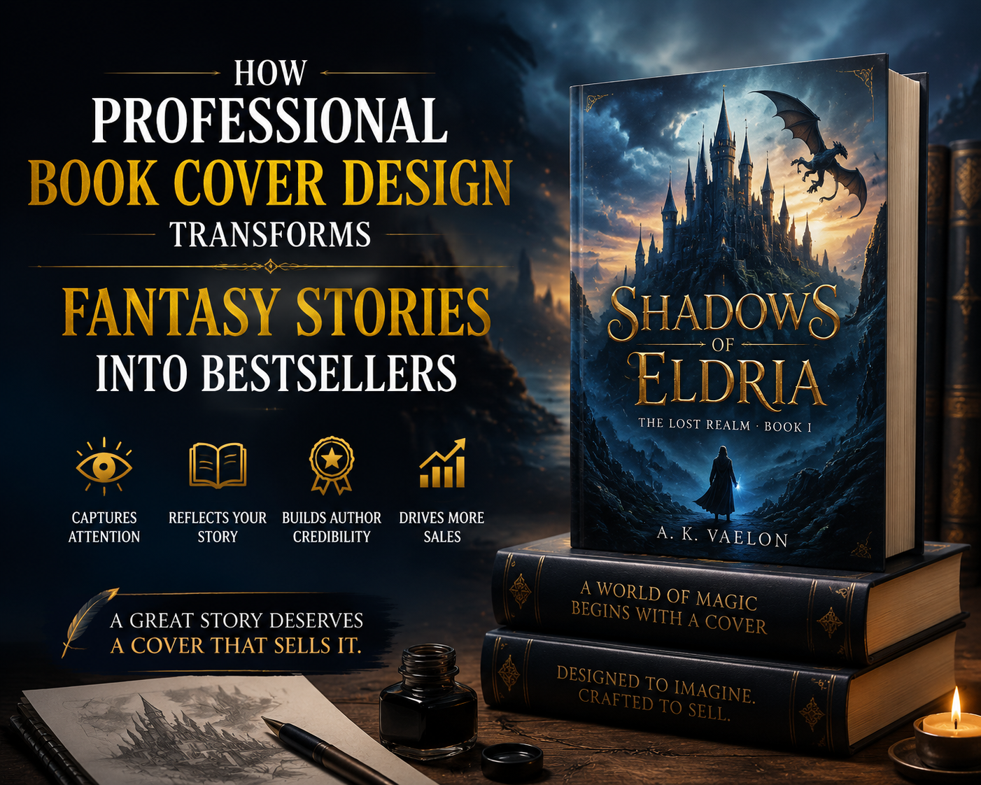
You have three seconds. That’s all the time a reader gives a book before they decide to look closer — or scroll past. In fantasy, where the shelves overflow with dragons, empires, and magic systems, your cover is not decoration. It is your first and most powerful marketing asset. And if it’s designed by a professional, it can be the difference between “hidden gem” and New York Times bestseller.
1. The Fantasy Reader Judges the Book by Its Cover — And That’s a Good Thing
Fantasy is the most visually competitive genre in publishing. Walk into any bookstore and you’ll notice: fantasy readers are trained to read covers like a language. They look for genre cues — the sweep of a cloak, rune-etched swords, celestial maps, glowing sigils — to instantly decide whether a book belongs on their shelf.
This is not shallow behavior. It is pattern recognition built by thousands of hours of reading. Your cover signals subgenre, tone, stakes, and audience in a single glance. A dark grimdark epic needs a different visual grammar than a whimsical fae romance. A professional designer understands these codes and uses them strategically.
According to a Nielsen Books & Consumer study, cover design is the number one factor influencing a first-time buyer’s purchase decision — ranking above author name, title, and even back-cover blurb. In digital retail, this effect is amplified: your cover thumbnail must communicate genre and quality in 80×80 pixels on Amazon or Goodreads. A blurry, generic, or amateur cover does not just fail to attract readers — it actively repels them.
2. What Professional Fantasy Book Cover Design Actually Involves
Many authors — especially indie authors — make the mistake of thinking professional design means “making it look pretty.” In reality, professional book cover design for fantasy is a multi-layered discipline that blends:
- Genre Signal Architecture: Placing genre cues (typography style, color palette, iconography) that immediately communicate subgenre to trained readers.
- Typography as Storytelling: Serif fonts whisper ancient empires; sharp, geometric type screams dark academia; flowing scripts invoke romance and magic. The wrong typeface on a fantasy cover is like the wrong key in a lock.
- Color Psychology: Deep navy and gold communicate epic fantasy. Pale lavender and silver suggest fae. Crimson and bone signal grimdark. These are not accidents — they are deliberate emotional triggers refined over decades of genre publishing.
- Retail Optimization: A professional knows how the cover will appear at 80px (Amazon thumbnail), 300px (Goodreads listing), full-size (print), and as a social media graphic. Each context has different demands.
- Composition and Focal Hierarchy: Where does the eye land first? Second? A trained designer controls this journey to maximize impact and information delivery.
3. The ROI of Professional Cover Design: Numbers That Matter to Indie and Traditional Authors
If you’re investing months — sometimes years — writing a fantasy novel, skimping on the cover is like building a mansion and putting a cardboard door on it. Here’s what the data tells us about the return on professional design investment:
- Books with professional covers convert at 3-5x higher rates on Amazon compared to titles with template-based or DIY covers, according to data from indie publishing communities including the Alliance of Independent Authors.
- Fantasy is one of the highest-revenue genres in indie publishing — the top 1,000 fantasy titles on Amazon KDP generate millions in annual royalties. The differentiating factors among that top tier? Cover quality is consistently ranked in the top three.
- Bookstagram and BookTok — two of the largest book discovery channels in the world — are inherently visual platforms. A stunning cover dramatically increases the likelihood of organic, unpaid user-generated promotion.
- Traditional publishers spend between $5,000 and $30,000 on cover design for commercial fantasy titles. While indie authors don’t need to reach those figures, it illustrates that the industry’s biggest players consider cover design a primary commercial investment, not an afterthought.
4. Five Ways a Professional Cover Transforms a Fantasy Story’s Market Position
4.1 It Establishes Credibility Before Page One
Readers are skeptical. They’ve been burned by boring books that looked exciting. A polished, professional cover tells them: “The person behind this book takes their craft seriously.” It is a visual quality guarantee that lowers the barrier to purchase — especially for unknown authors.
4.2 It Positions the Book Accurately Within Its Subgenre
Mislabeled fantasy is one of the most common causes of negative reviews. When a reader expecting epic high fantasy picks up what is actually a cozy portal fantasy, they’re disappointed — not because the book is bad, but because expectations were mismanaged. A professional cover designer researches comparable titles, studies subgenre conventions, and positions your book precisely where it will attract its ideal reader.
4.3 It Creates Series Identity and Reader Loyalty
Fantasy readers are loyal — they binge series, pre-order sequels, and follow authors across platforms. A professional cover designer creates a cohesive visual system across your series: consistent typography, a recurring color family, shared design motifs. When a reader sees Book 3 in a shop and instantly recognizes it as part of a series they love, that’s intentional design doing its job.
4.4 It Enhances Discoverability in Algorithm-Driven Retail
Amazon’s algorithm rewards engagement — clicks, page reads, add-to-wishlists, purchases. A professional cover that drives clicks signals to the algorithm that your book is relevant and desirable, which boosts organic visibility. It’s one of the few levers an author controls that directly influences algorithmic ranking.
4.5 It Becomes Your Primary Marketing Asset
Every ad you run, every newsletter you send, every social media post featuring your book — the cover is front and center. A mediocre cover makes every marketing dollar work harder and achieve less. A stunning cover generates organic sharing, word-of-mouth, and branded recognition that money can’t easily replicate.
5. Red Flags: What Makes a Fantasy Cover Hurt More Than Help
Understanding what damages a cover’s commercial potential helps you make better decisions — whether you’re working with a designer or evaluating your existing cover:
- Stock photo composites with recognizable models: Readers have seen the same red-haired woman in a forest on 200 other covers. It signals low investment and zero originality.
- Mismatched tone and visual style: A lighthearted comedy with dark, violent imagery. A brutal war saga with whimsical watercolor illustration. Tone mismatch is confusing and off-putting.
- Illegible typography: If your title and author name can’t be read at thumbnail size, readers won’t try. Clarity is more important than flair.
- Overcrowded design: Trying to put the entire plot summary into the cover image. Strong covers have a single, compelling focal point — not a chaotic collage.
6. How to Work With a Professional Book Cover Designer: A Practical Guide
Getting the most from professional cover design requires preparation. Here’s what a smooth, productive process looks like:
- Build a mood board: Gather 10-15 published fantasy covers you love (and specify what you love about each — the color? The composition? The typography?). This gives your designer a visual vocabulary to work from.
- Write a cover brief: Describe your book’s tone, target audience, subgenre, comparable titles, key visual elements (world, characters, objects), and what you want the cover to make readers feel.
- Know your retail requirements: Are you publishing on Amazon KDP? IngramSpark? Both? Your designer needs to know the technical specifications (spine width, bleed settings, file format) for each platform.
- Budget for revisions: Professional cover design typically includes 2-3 revision rounds. Use them thoughtfully — consolidate feedback, be specific, and avoid changing direction entirely mid-project.
- Think series from day one: Even if you’re publishing Book 1 only, brief your designer on the series arc so they can establish a scalable visual system you won’t need to redesign later.
7. Innovacia Publishers: Where Fantasy Covers Become Bestseller Machines
At Innovacia Publishers, we’ve built our design philosophy around one truth: your story deserves to be seen. We work exclusively with fantasy authors to create covers that don’t just look beautiful — they perform. They convert browsers into buyers, generate organic social sharing, and establish the kind of brand identity that turns first-time readers into lifelong fans.
Our process begins with deep research into your subgenre, comparable titles, and target reader psychology. We don’t use templates. We build every cover from the ground up, with custom typography, original illustration or curated imagery, and a color strategy grounded in both genre convention and emotional intelligence.
Whether you’re an indie author publishing your debut novel or an established writer rebranding a backlist series, we have the expertise to transform your book’s visual identity — and its sales trajectory.
Ready to turn your fantasy novel into a bestseller?
Visit innovaciapublishers.com and book a free cover consultation today.